The pathway network
The pathway network draws your result as a graph: one node per enriched pathway, one edge wherever two pathways are related. It is the quickest way to see whether a long list of significant pathways is one story or several unrelated ones.
It sits in the lower half of the Pathway explorer card on the results screen, under the heading Pathways network. Each pathway database gets its own network inside its own tab, with its own settings. A network is built the first time you open its tab — until then the canvas reads Building network… — and while the layout runs the nodes move without their edges or their classification badges, which are drawn once it stops.
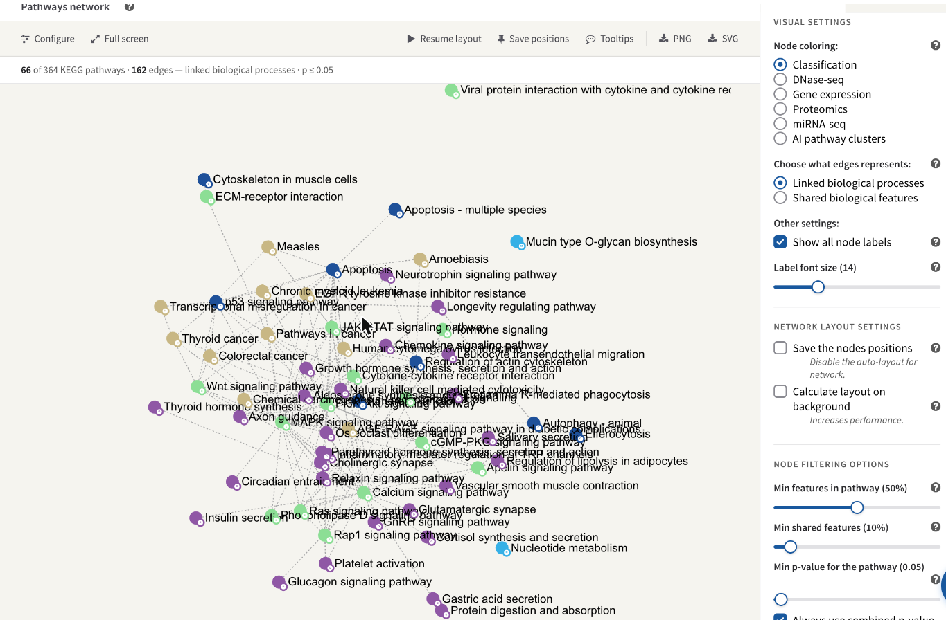
The KEGG network of the STATegra example: 66 of the 364 matched pathways drawn, 162 edges, nodes coloured by classification, with the Visual settings pane on the right.
What a node is
A node is one pathway of this database that passed four tests:
- your input matched at least one feature in it;
- it is still showing under the category filter in the band above the network (see Pathway classification);
- your input covers enough of it — the Min features in pathway filter;
- its p-value is at or below the Min p-value for the pathway threshold.
The organism's whole-metabolism map (mmu01100 for mouse) is left out
deliberately: it contains most of metabolism, so it would connect to almost
everything and tell you nothing.
Size is derived from how far the pathway's p-value sits below the threshold, and the drawn range is stretched across the whole network. So within one graph the largest node is the most significant pathway on screen and the smallest is the one sitting at the cut-off. It is a ranking, not a scale: the same pathway will be drawn at a different size once you move the threshold or change which p-value is being read.
The letter badge at the bottom right of a node is the initial of the pathway's main classification, in that classification's colour. It is drawn whatever colouring you choose, so you can still read the classification while the fill colour is showing something else.
Hovering a node haloes it and everything it is joined to. Hold for about half a second and a card appears with the pathway's name, its classification, its trend for the omic you are colouring by, and two buttons: Show details opens the full per-omic table in the Details pane beside the graph, and Paint leaves the results screen and opens that pathway's painted diagram. Nodes can be dragged, and the canvas pans and zooms.
The status line
The line under the toolbar says exactly what was drawn, so a graph that is nearly empty can be told from one that failed to build:
66 of 364 KEGG pathways · 162 edges — linked biological processes · p ≤ 0.05
In shared-features mode it also carries the similarity threshold. If there are nodes but no edges at all it adds a warning that no pathway pair passed the edge filter and suggests the other edge type — that case is a filter result, not a bug.
The two kinds of edge
The Choose what edges represents radio pair decides what an edge means. The two are unrelated: pathways that share many of your genes may have no link in the database, and linked pathways may share nothing you measured.
Linked biological processes is the default. The edge is a statement the database itself makes about the two pathways: in KEGG, a link drawn on one pathway map to another map; in Reactome, the pathway hierarchy — two processes under a common parent, or one nested inside another — together with any sub-pathway a diagram embeds. These edges are read from the installed database, so they say nothing about your data; the same pairs would be joined for any job on this organism.
Shared biological features derives the edges from your own results instead. For every pair of drawn pathways, PaintOmics pools the genes and the compounds your input matched in each and computes the Sørensen–Dice coefficient
S = 2 |A ∩ B| / (|A| + |B|)
An edge is drawn where S is at least Min shared features, dotted, and thicker the higher S. A pathway with no matched feature cannot have an edge in this mode. Note that a coefficient counts features, not their importance: two pathways can score highly because they share a handful of ubiquitous enzymes.
Note
The in-app help tip beside Min shared features still describes an older rule — a percentage of the smaller pathway. What is actually compared against the slider is the Dice coefficient above, which uses the sizes of both pathways.
The Visual settings pane
The rail to the right of the graph has two panes, chosen by the tabs at its top. Tools holds everything that changes what is drawn, under the heading Visual settings; the toolbar's Configure button brings it forward. Details holds the legend for the current colouring, and the detail of the last pathway you opened. The × beside the tabs hides the rail and gives the graph the whole card, and the bottom edge of the panel can be dragged to make the canvas taller.
Nothing in the Tools pane takes effect until you press Apply at the foot of it, which rebuilds the network. Settings belong to one database tab — the KEGG and Reactome networks of the same job are configured separately — and are saved with the job on the server, so re-opening the job, or opening a link somebody shared with you, shows the same view. On a job opened read-only a notice at the top of the page says changes will not be saved; see Accounts, storage and sharing.
Node coloring
| Option | What the colour means |
|---|---|
| Classification | The pathway's main classification in this database — the default, and the same palette the category pie and the table's colour stripe use. |
| One entry per gene-based omic | The metagene cluster the pathway falls into for that omic, i.e. the regulatory trend its features follow. Grey means the pathway has no metagene for that omic. See Metagenes. |
Only gene-based omics are offered as colourings; there is no metagene clustering for compound data.
The Details pane is the legend for whichever of these is in force. Colouring by classification lists every classification with its letter badge. Colouring by an omic reports how many of that omic's clusters have nodes in this network out of how many exist, and draws each one's trend; clicking a trend hides that cluster's nodes and clicking it again brings them back.
Under the omic-cluster legend there is a Modify number of clusters slider (1 to 20) with its own Apply. It re-runs the clustering for that omic and that database with the number of clusters you ask for and replaces the pathways' cluster assignments. It is a queued server job, not an instant redraw, and it is hidden on a read-only job.
Labels
Show all node labels is on by default and draws a label for every node. Turn it off and a label appears only once its node is large enough on screen, which is what zooming in does; the help tip warns that showing every label costs performance. Label font size is a slider from 1 to 50, default 14.
Network layout settings
The layout is force-directed: nodes repel each other and edges pull their two ends together, so groups of related pathways settle next to one another. It stops on its own once the graph settles, or after 20 seconds, whichever comes first, and can be run again at any time from the toolbar's Resume layout.
| Control | What it does |
|---|---|
| Save the nodes positions | Pins every node where it currently sits, so the arrangement is restored next time instead of being recomputed. With positions pinned, opening the network no longer runs the layout at all. Unticking it and pressing Apply throws the pinned positions away. |
| Auto-save positions | Appears once positions are pinned. Re-saves them on every Apply, instead of your having to press Save positions in the toolbar first. |
| Calculate layout on background | Computes the layout without animating it and applies the finished arrangement in one go. Faster on a large network, but nothing moves on screen until it is done. |
If some nodes have pinned positions and the filters then admit nodes that have none — you lowered a threshold, or showed a category again — the layout is run once to place them, and the nodes you had already pinned keep the positions you gave them.
Node filtering options
The last group in the Tools pane decides which pathways become nodes at all.
Min features in pathway
A pathway is dropped unless your input covers at least this share of it. The slider runs from 0 to 100% in steps of 5, and it starts at 50% for a job that includes gene-based data and 10% for a compound-only job — a metabolomics platform covers far less of a pathway than an RNA-seq experiment does. On the STATegra metabolomics data the median coverage was 10.1%: at 50% only 6 of its 140 pathways cleared the bar, against 75 at 10%.
What is divided by what:
- the numerator is the number of features of that pathway your input matched — matched genes plus matched compounds;
- the denominator counts the pathway's own size over the kinds of feature you submitted, and nothing else. A transcriptomics or proteomics job is measured against the pathway's genes, a metabolomics-only job against its compounds, and a job carrying both against the sum of the two.
The filter does not apply to every database
Whether the coverage filter runs at all is decided by the feature count the pathway carries in the installed database, and that count has always meant genes. Where it is missing or zero, no coverage filter is applied to that pathway at any slider setting — it is drawn however little of it you matched. That is deliberate: those pathways have never been filtered on coverage, and switching a 50% filter on for them now would empty the network rather than clean it up.
In practice this means: an OmniPath network is never coverage-filtered, because OmniPath ships no such count; neither is a MapMan network, because every bin carries zero; and 220 of the 584 mouse KEGG maps are exempt for the same reason. Reactome pathways and the remaining KEGG maps do carry a count and are filtered normally. So the same slider position means different things in different database tabs, and the node count in an OmniPath tab will not move when you drag it.
Min shared features
The similarity an edge must reach in Shared biological features mode, default 10%. It compares against the Dice coefficient described above and has no effect at all in Linked biological processes mode.
Min p-value for the pathway
The significance cut-off a pathway must clear to be drawn: a slider from 0.005 to 1 in steps of 0.005, default 0.05. It is also the reference node size is computed from, so moving it rescales the nodes as well as changing which ones appear.
Which p-value is read
Two controls decide which p-value the threshold is applied to. Both live under the slider.
Always use combined p-value is ticked by default. When the network is coloured by one omic, ticking it keeps the filter on the combined p-value across all your omics; unticking it makes the filter use that omic's own p-value, so the graph shows the pathways that are significant for the data you are looking at. It makes no difference when colouring by classification or by AI clusters, which always use the combined value. Which combination is used — Fisher or Stouffer — is whatever is selected in the Show combined p-values control of the enrichment table below.
P-value selection criteria chooses between the raw p-value (None, the default) and the two multiple-testing corrections, FDR BH and FDR BY. Adjusted values are stricter, so expect fewer nodes.
Where the selected p-value has one value per condition, the network compares the smallest of them — a pathway significant in any one condition is drawn.
The toolbar
| Button | What it does |
|---|---|
| Configure | Brings the Tools pane of the rail forward, and re-opens the rail if it was hidden. |
| Full screen | Expands the graph, its toolbar and its rail to fill the window, so you can rearrange a crowded network. The button becomes Exit full screen; Esc also returns it to the page. |
| Resume layout / Stop layout | Starts or stops the force-directed layout. If node positions are pinned, resuming asks you to confirm first, because it discards them. |
| Save positions | Pins the nodes where they are now — the same thing as ticking Save the nodes positions — and confirms with a brief Saved. Use it after arranging a network by hand. |
| Tooltips | Turns the hover card on and off. It is on when the page loads. |
| PNG | Stops the layout and downloads the canvas as it appears, as paintomics_network_<database>_<jobID>.png. It captures the visible canvas, so pan and zoom to frame what you want first — nodes off screen are not in the file. |
| SVG | Stops the layout and downloads a vector version with the node labels and the underlying data, as paintomics_network_<database>_<jobID>.svg. This is the one to use for a figure you intend to edit. |
Reading it honestly
The network is a view of the enrichment result, not a separate analysis. Every node in it is a row of the enrichment table, and every threshold in the Tools pane changes what you see without changing what was computed. Two consequences are worth keeping in mind.
An edge is not evidence of a mechanism. In the default mode it is a curation decision made by KEGG or Reactome, and in the other mode it is an overlap between two feature lists your own input produced.
And the graph you export is the graph your filters left. The status line above the canvas records the thresholds that produced it — quote them alongside the figure, or the same job will look like a different result at another setting.