A worked example: RNA-seq and DNase-seq
This page follows one real analysis from the files to a conclusion. The reference pages are organised by feature; this one is organised by the question, and it uses the numbers a single run actually produced rather than invented ones. It is a companion to Your first analysis, which is the screen-by-screen mechanical guide — that page tells you where to click, this one tells you what to make of what appears. Read that one first, or keep it open beside this.
Every figure and every number below comes from one job: the bundled STATegra — real mouse Ikaros time course (5 omics) example, run against KEGG, Reactome and OmniPath for Mus musculus.
The experiment
Ikaros is a transcription factor required for B-cell lineage commitment. In the
published STATegra experiment, a mouse B3 pre-B cell line carries an inducible
Ikaros construct; tamoxifen switches it on, and five omic layers are measured
at six time points afterwards. Each value in the uploaded files is an
Ikaros-over-control log2 ratio at one time point, averaged over three
biological replicates per arm. The six conditions are IKvsCtr_0h, _2h,
_6h, _12h, _18h and _24h.
The data are from Gomez-Cabrero et al., STATegra, a comprehensive multi-omics dataset of B-cell differentiation in mouse, Sci Data 6:256 (2019), doi:10.1038/s41597-019-0202-7.
| Layer | What it measures | Identifiers in the file | Source accession |
|---|---|---|---|
| Gene expression | Transcript abundance, 12,762 genes | Ensembl gene IDs | GSE75417 |
| Proteomics | 2,384 protein groups | Gene symbols | PXD003263 |
| miRNA-seq | 42,421 gene–miRNA pairs, paired against the miRBase target table | gene:::miRNA associations |
GSE75394 |
| DNase-seq | Chromatin accessibility, 52,788 consensus regions collapsed onto genes | Ensembl gene IDs after region assignment | GSE75390 |
| Metabolomics | 58 analytes | Compound names | MetaboLights MTBLS283 |
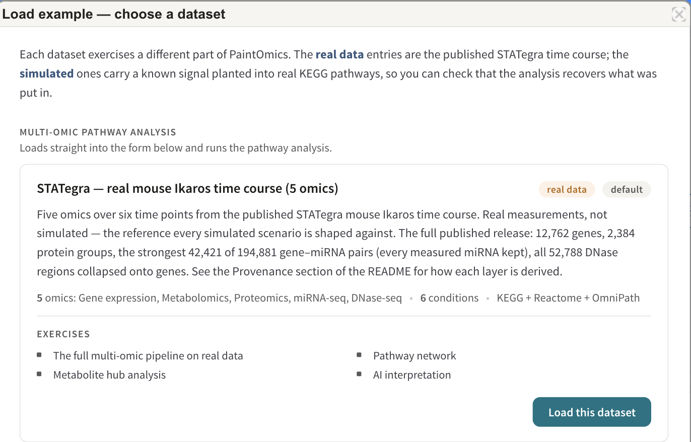
The dataset used throughout this page. Load example in the top bar loads it, files and all, so you can reproduce every figure below.
The question the analysis is being asked is a single one: does inducing one transcription factor produce a change that is coherent across chromatin, transcript, protein and metabolite, and if so, where?
First, the layers that are not gene-level
Three of the five layers measure something a pathway database has never heard of. Pathways are drawn on genes and compounds, so a layer measured on anything else has to be converted into one of those two before it can be enriched or painted — and that conversion is an interpretation you are responsible for, not a formatting step.
DNase-seq is the clearest case, and it is the reason this page exists.
Turning an open region into a claim about a gene
A DNase-seq peak is an interval: chromosome, start, end. On its own it says that a stretch of chromatin was more accessible after induction than before. That is not yet a statement about any gene, and pathways contain no intervals.
PaintOmics closes the gap with RGmatch, which associates each region with every gene within a search distance — one row per region–gene pair — and records which area of the gene the region falls in: upstream, promoter, TSS, first exon, intron, gene body, downstream. You then choose the areas that carry your hypothesis. For an accessibility change you expect to act on transcription initiation, promoter and TSS are the areas that matter, and a region sitting in the gene body of a neighbouring gene is noise. Where several kept regions land on the same gene, their values are summarised into one — by default the mean. The settings and the defaults are on Preparing your data.
In this dataset that step turns 52,788 consensus DHS regions into 23,273 gene rows, and those rows are what the pathway analysis sees.
The reasoning is worth stating plainly, because the rest of the analysis inherits it:
- What you gain. "A region opened" becomes "this gene's promoter opened", which is a claim a pathway can hold, can be tested for enrichment, and can be painted next to that gene's transcript and protein values.
- What you assume. That proximity implies regulation. It often does at a promoter and often does not at distance: an enhancer can act across hundreds of kilobases and skip the gene next to it, and a region within the search distance of two genes is credited to both. Neither error is visible downstream — by Step 2 the layer looks exactly like an ordinary gene-level omic.
- What follows. Treat a DNase-seq p-value as evidence about accessibility near the pathway's genes, not about the genes themselves. It is at its strongest when it agrees with the transcript layer on the same genes, which is exactly what the pathway view lets you check.
The miRNA layer has the same shape: miRNA quantification is paired with a
target-prediction table, and each gene:::miRNA pair carries the assumption
that the predicted target is a real one. Metabolomics has a smaller version of
the same problem — a compound name is not an identifier, and this run had 47
names that matched more than one KEGG compound.
Step 2 — how much of each layer survived
| Omic | Mapped | Unmapped |
|---|---|---|
| Gene expression | 11,296 (89%) | 1,466 |
| Proteomics | 2,363 (99%) | 21 |
| miRNA-seq | 8,585 (100%) | 33 |
| DNase-seq | 16,491 (71%) | 6,782 |
| Metabolomics | 52 (90%) | 6 |
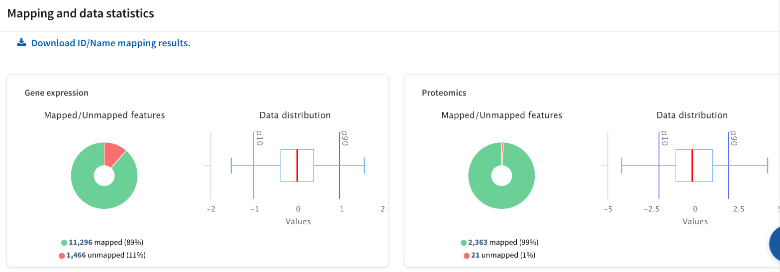
Two of the five mapping cards. The doughnut is the mapped/unmapped split; the box plot beside it is the distribution of the values that will be coloured, with the 10th and 90th percentiles marked.
Three things in that table are worth reading rather than glancing at.
The spread is a property of namespaces, not of data quality. Proteomics maps at 99% because it arrives as gene symbols, which is close to the domain KEGG is keyed on for mouse. Gene expression maps at 89% because Ensembl carries gene models — predicted, non-coding, retired — that a curated identifier set never adopted. Nothing was done wrong to the 1,466. See Supported identifiers.
DNase-seq at 71% is the lowest, and it is the derived layer. Its 23,273 rows are only as good as the genes RGmatch assigned regions to; a region whose nearest gene has no entry in the pathway databases contributes nothing, however clean the peak was. A low rate on a derived layer is a question about the annotation and the assignment settings, not about the assay.
Metabolomics is 52 features. Not 52%, fifty-two features. Hold that number: it governs everything the compound-based analyses can and cannot say later on this page.
The 47 ambiguous compound names are settled on this screen, one card per name, and it is worth the minute. Alanine is the standard trap: the bare name, L-alanine, D-alanine and β-alanine are four separate KEGG compounds in different pathways, and the exact-name match is not automatically the one you measured.
Step 3 — 1,007 pathways found, 114 significant
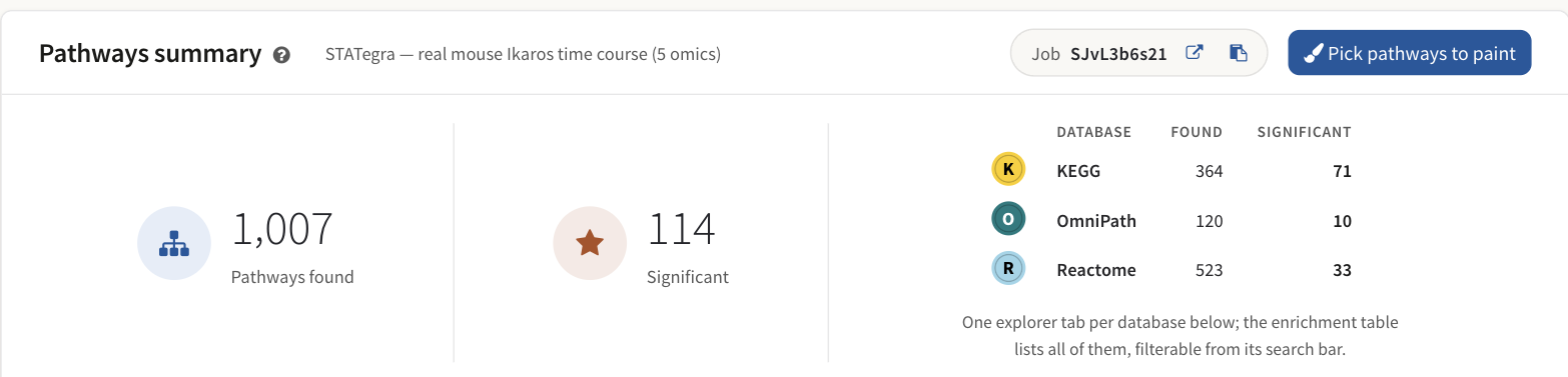
The summary at the top of the results screen, with the per-database breakdown.
| Database | Found | Significant |
|---|---|---|
| KEGG | 364 | 71 |
| OmniPath | 120 | 10 |
| Reactome | 523 | 33 |
| Total | 1,007 | 114 |
"Found" means the pathway contains at least one feature you uploaded and PaintOmics matched. "Significant" means a p-value of 0.05 or less — a fixed threshold, not one you set. On a job like this one, spanning three databases, that is the combined p-value under the method chosen in Show combined p-values, so the significant count moves when you change the method — see Pathway enrichment.
Do not read the three rows as a league table. Reactome finds the most pathways and returns the fewest significant ones because it decomposes biology into many small reaction sets, and each is tested against its own Reactome background; KEGG's maps are larger and fewer. The databases differ in granularity, scope and identifier type by design (Reactome, OmniPath). A pathway significant in one and absent from another is usually a difference in how biology was carved up, not a contradiction.
114 significant pathways is also more than anyone can read. The network is the tool that makes it tractable.
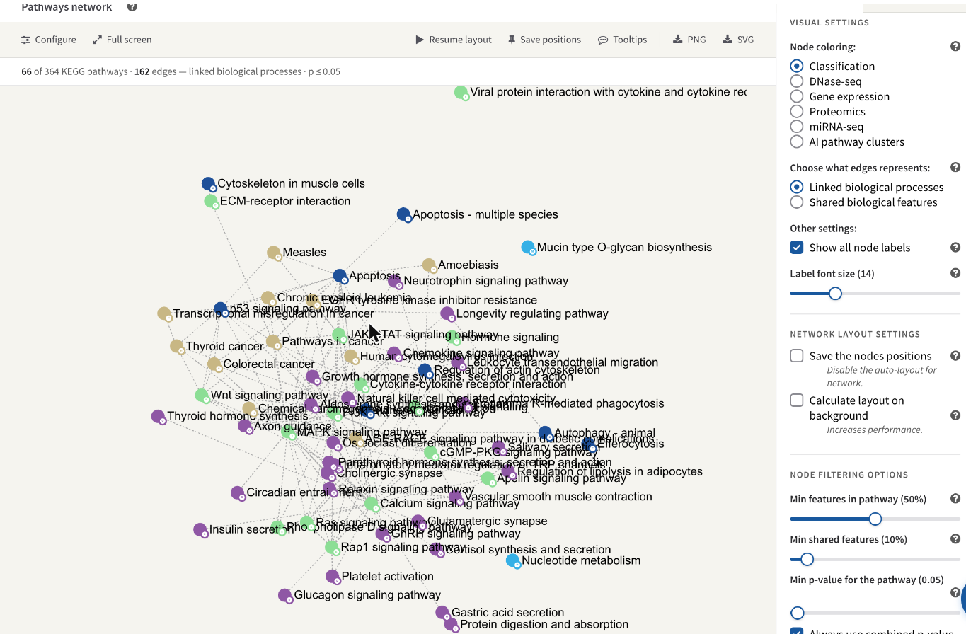
66 of the 364 KEGG pathways, joined by 162 edges, filtered to p ≤ 0.05.
The filter that draws this view keeps pathways at p ≤ 0.05 and edges where two pathways share enough features. What it shows is that the 71 significant KEGG pathways are not 71 independent findings: they are a much smaller number of connected neighbourhoods, and a cluster of adjacent nodes is one story counted several times. The pathway network covers the colourings, the two kinds of edge, and how to read shared-feature edges without over-claiming.
The compound analyses, and their honest size
Two analyses on the results screen work on the metabolite layer. Both were run, and both have to be read against those 52 mapped compounds.
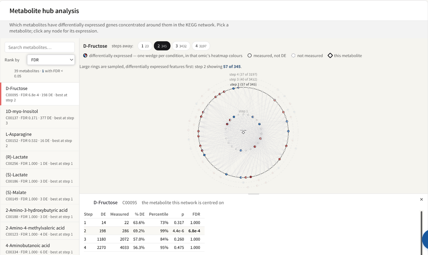
39 metabolites scored; D-Fructose is the one that survives correction.
The hub analysis asks whether differentially expressed genes are concentrated
in the reaction neighbourhood around a metabolite. It scored 39 metabolites,
and one passed FDR < 0.05: D-Fructose (C00095), FDR 6.8e-4, with 198
differentially expressed genes in its neighbourhood, strongest at two steps
away.
One hit out of 39 is not a disappointing result; it is the resolution the input supports. The FDR is Benjamini–Hochberg over every scored metabolite at every radius at once, the null DE rate is taken from the same data being tested, and the four radii of one metabolite are nested views of the same evidence rather than four independent tests. The full set of assumptions is on Metabolite hub analysis, and they all argue for reading a single well-separated hit rather than a ranking.
The class activity test also ran — the binomial, because this dataset uploads six ratio columns and a relevant-features list rather than per-sample columns and a design. At BRITE level 2, 5 of 8 classes passed BH < 0.05 and 2 classes had fewer than three members, which is too few to test. Amino acids scored 23 of 30 measured compounds relevant, FDR 1.4e-23.
That exponent needs a caveat in the same breath. The binomial's null is no member of this class truly changed, so a member reaches the relevant list only by type-I error at the α the list was built at — 0.05 here. Twenty-three of thirty against a 0.05 null is astronomically unlikely by construction, which means the number is a statement about the relevant list you supplied, and it inherits every property of the test that produced it. It is not independent corroboration. On a targeted 58-analyte panel where much of what was measured moved, that is the expected shape of the answer, not a discovery. The alternative competitive null and its own limitation are described on Metabolite class activity.
One pathway, read properly
Purine metabolism is one of the significant KEGG maps. Opening it puts all five layers on the same diagram.
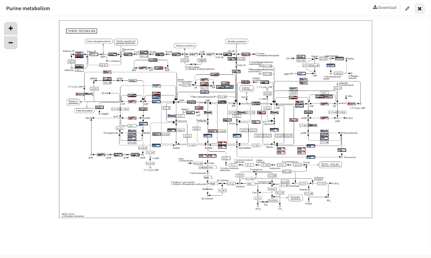
Purine metabolism with five omics over six time points. Each matched feature is one box, split into one cell per condition, blue below the reference and red above.
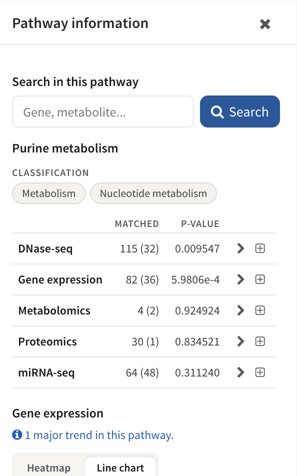
The per-omic table beside the map: matched features, how many were in the relevant list, and the p-value for each layer.
| Omic | Matched | Relevant | p |
|---|---|---|---|
| Gene expression | 82 | 36 | 5.9806e-4 |
| DNase-seq | 115 | 32 | 0.009547 |
| miRNA-seq | 64 | 48 | 0.311240 |
| Proteomics | 30 | 1 | 0.834521 |
| Metabolomics | 4 | 2 | 0.924924 |
This is the table the whole page has been building towards, because four of its five rows teach something different.
Gene expression and DNase-seq carry the pathway. They are the two smallest p-values, they are computed on overlapping gene sets, and they agree: the transcript response and the accessibility signal near the same genes both concentrate in this map. That agreement is the strongest single thing this run says about Purine metabolism, and it is exactly the claim the region-to-gene step was set up to allow. It remains conditional on the assignment: these are regions near those genes.
miRNA-seq matched 64 with 48 relevant, and still returned p = 0.311. A high relevant count is not evidence. The test is hypergeometric — it asks whether 48 of 64 is more than you would expect when a large share of the whole matched miRNA background is already flagged relevant, and here it is not. Never read a relevant count without its p-value, and never read a p-value without its matched count.
Proteomics matched 30 features and flagged 1. With k = 1 the test has essentially nothing to work with, and p = 0.83 records that. Protein-level change is slower and shallower than transcript change; the honest reading is that this run does not resolve a protein response in this pathway, not that there is none.
Metabolomics returned p = 0.92 on 4 matched compounds. This is the number to be blunt about. Purine metabolism contains dozens of compounds; four of them were measured at all, because the panel has 58 analytes. Two of those four were relevant. A p-value computed on n = 4 has almost no resolution, and the test is right-tailed, so a pathway whose compounds are conspicuously unchanged can never produce a small p-value either. p = 0.92 records the absence of a measurement, not the absence of an effect. Reporting "metabolomics does not support purine involvement" from this cell would be wrong.
The combined p-value in the enrichment table pools all five of these columns. It is useful for ranking 1,007 pathways down to something readable; it is not a substitute for this table. Read the per-omic columns of any pathway you intend to make a claim about — the combination cannot tell you that two of its five inputs were carried by four compounds and one flagged protein.
Clicking any painted box opens the feature across every omic that measured it, which is where a per-gene version of the same cross-layer check lives; see Feature details and The pathway view.
What the AI made of the whole result
Asked to interpret the job, PaintOmics AI walks the network of every KEGG, Reactome and OmniPath interaction for mouse with this job's values on its nodes. It starts from the nodes whose neighbourhoods hold surprisingly many relevant features, reads the values at every stop against the time-course design, and writes what the chain shows as a checked Results section: every quoted value is matched against the upload, every leg is an interaction a database draws, and every citation was retrieved and read.
The result is a draft written by a language model, and it should be read the way you would read a capable colleague's first pass: its values are checkable against the job, its legs against the pathways that draw them, and its citations against the papers. The interpretation sets out what it does, what it is given, and what it cannot do.
What this run shows, and what it does not
It shows that the chromatin and transcript layers respond coherently and land on the same pathways, that the response is a small number of connected neighbourhoods rather than 114 findings, and that one metabolite — D-Fructose — has a transcriptional response concentrated around it that survives correction across the whole table.
It does not show anything about purine metabolites, about most of the proteome, or about which of the two lowest p-values in Purine metabolism is causally upstream of the other. It does not show that a miRNA layer with 48 relevant features in a pathway is contributing to that pathway's significance. And a p-value of 0.92 in this run is, in three of the five layers, a statement about coverage.
One example is one example
These totals came from one job on one server. Pathway counts depend on the KEGG snapshot a host carries, so the same dataset yields different totals on a different installation, and the significant counts also move with the p-value combination method chosen on the enrichment table. Use the shapes and the reasoning here; re-measure the numbers on your own run.
Where to go next
- Run it yourself: the dataset and everything else in the catalogue are on The example datasets.
- The mechanics, screen by screen: Your first analysis.
- Why the DNase layer looks the way it does: Preparing your data.
- What each p-value on this page is: Pathway enrichment.
- Grouping 114 pathways into something readable: The pathway network and Pathway classification.