Feature details
Every painted box on a pathway diagram carries the values PaintOmics matched to that point of the map. This page covers the two ways to read them: the small popup that opens on the box itself, and the Feature set overview panel behind its Show details button. For the diagram as a whole — how the boxes are painted, and the colour settings they obey — see the pathway view.
The popup on a painted box
Hover a painted box for half a second and a small window opens beside it. Clicking the box opens the same window at once and pins it. An unpinned window stays while the pointer is over it or over the box, and closes half a second after the pointer leaves both; a pinned one stays until you close it, so you can leave several open over the diagram and compare them. Dragging a window anywhere also pins it.
Three tools sit in the window header:
| Tool | What it does |
|---|---|
| Pin | Keep or not this window open. Toggles to an unpin once the window is pinned. |
| Plus | Show or hide more information — reveals the feature's other names and its external links. Toggles to a minus. |
| Close | Close this window. |
The title is the map's own label for that box, or the feature's name where the map has none. A red star after the name means the feature is relevant — your relevant-features file listed it for at least one condition. A gold star means it has a relevant association, which is what a significant regulator link produces (see Regulatory omics).
Pinned windows do not survive a change of pathway: opening another map, or pressing Go back, closes all of them.
Heatmap and Line chart
The body of the window shows the same numbers two ways, switched by the Heatmap / Line chart pair of buttons.
Heatmap draws one row per measured value and one cell per experimental column, labelled with the omic name and the feature's display name — its symbol where PaintOmics resolved one, otherwise the identifier you uploaded. Cells are coloured on that omic's colour scale, the same scale the diagram box uses — with one exception: a box that was collapsed to metagenes is painted on the metagenes' own range, centred on zero, while the popup keeps colouring on the omic's. On such a box the shades in the popup and the shades on the diagram do not correspond, and only the numbers in the hover readout are comparable.
A star on a cell marks a condition for which the feature is relevant; stars are only drawn when the omic has more than one column, and a relevant-features file with a single column of identifiers means "relevant overall" and produces no per-cell stars at all — only the star beside the name. Marking single conditions needs a per-condition relevance file, one column per value column. An omic with no value for this feature still gets a row, drawn plain grey, so the omics stay in the same order from box to box. Hovering a cell gives the untruncated row name, the column it belongs to and the value itself.
Two things about the rows are worth knowing:
- The popup lists every omic of the feature's type that you uploaded, not just the ones you chose to draw on the diagram. A gene box shows all gene-based omics; a compound circle shows all compound-based omics.
- Where several measurements of one omic matched the same feature — three miRNAs against one gene, two uploaded metabolites against one compound — the popup draws one row each. The diagram box only ever draws one row per omic, so the popup is where you find out there is more than one measurement behind a box.
Line chart plots the same values rescaled onto the colour reference, so that the two ends of the colour scale sit at −1 and +1; the three grey gridlines are drawn at −1, 0 and +1. A point outside the reference range gets an orange marker: it is off the end of the scale, and the diagram cannot distinguish it from any other value out there. This chart carries no column labels — read the conditions off the heatmap.
More than one feature at the same position
A pathway map often draws several of your matched features at one point — a KEGG box that stands for several genes of the same orthology group, for instance. PaintOmics keeps everything drawn at one position together as a feature set, paints one member of it, and marks the box with a green plus at the bottom right.
The popup then carries a line reading "N more Genes at this position." with Prev. and Next links. Stepping through them changes which feature the popup describes and repaints the box on the diagram to match.
Where more than five features share a position, PaintOmics computes metagenes for that position and paints the first metagene instead of any single feature. The popup then gains a Genes / Metagenes pair of buttons, and Prev. / Next steps through whichever of the two is selected. See Metagenes for what a metagene is and how it is coloured.
External links
The plus tool expands the window with a block listing any other names the feature carries and links out to the databases that hold it:
| Feature type | Links |
|---|---|
| Gene | KEGG, Ensembl Genomes, Ensembl (vertebrates), GeneCards (human jobs only), related publications at PubMed, NCBI Gene, all NCBI databases |
| Compound | KEGG, PubChem Compound, ChEBI |
Feature set overview
Show details, at the foot of the popup, closes it and opens the Feature set overview panel between the diagram and the side panel. The same panel opens from the Show details button on a search result in the Pathway information panel, and from a click on a gene node in an OmniPath network, where there is no diagram box to hover.
The panel is titled for the set, not for one feature, because that is what a box is: everything the map draws at that one position. If the box you clicked stands for a single feature, the set has one member.
Its header carries hide, expand and shrink controls, and its left edge can be dragged to give the charts more room. Only one panel can occupy that slot, so opening it closes the Global heatmap, and opening the Global heatmap closes it.
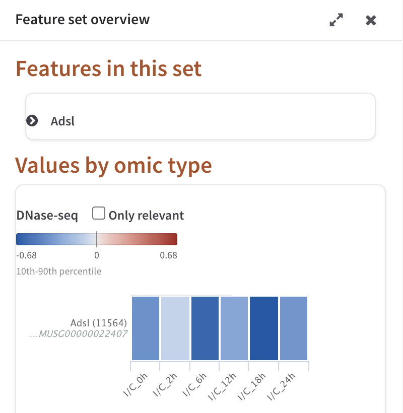
Feature set overview for a single-feature box: the collapsed feature card, then the DNase-seq block with its colour legend and one row of six conditions.
Features in this set
The first section lists every feature drawn at that position as a collapsible card. Expanding one draws that feature's heatmap and line chart — the same pair the popup shows, with the same meaning — followed by its external links. A card whose feature is relevant carries the red star beside its name, and its body carries the caption "Relevant for this omic", the same caption the popup shows. Cards are rendered on first expansion, so a set with many members opens quickly.
Values by omic type
The second section turns the set around: instead of one block per feature, one block per omic, holding every value that omic has for every feature in the set.
Each block has a heading with the omic's name, an Only relevant checkbox, and a colour legend showing the two ends of the scale, a tick at zero when the range crosses it, and a caption naming the reference the ends come from — "10th-90th percentile" by default. This is the same reference the diagram is painted with, and changing it in Settings repaints this panel too.
Below the legend the block draws a heatmap and, beside it, a line chart of the same rows:
- The heatmap. One row per measured value, one cell per condition. The row label is the feature's symbol with its KEGG identifier above the identifier you uploaded, with a red star for relevant and a gold star for a relevant association; hover the label for both in full. Cells carry the same per-condition stars as the popup heatmap, under the same rule.
- The line chart. The same rows as raw values, one line each, with the real condition names on the axis. Hovering a row of the heatmap greys out every line in the chart except that row's, which is how you follow one feature through a crowded block.
Where a block holds more than five rows they are clustered before drawing — euclidean distance, complete linkage — so that similar profiles sit next to each other. No dendrogram is drawn here; for one, use the Global heatmap.
Only relevant redraws both charts with just the rows that are relevant, or that carry a relevant association, for that omic. Unticking it brings the rest back.
"scale max" and "scale min"
When the colour reference is narrower than the data — which it is by default, since the 10th and 90th percentiles clip a tenth off each end — the line chart draws two faint hairlines labelled scale max and scale min at the two ends of the reference, and marks in orange every point outside them.
Read them as the limit of what the colours can tell you. Two features whose values both sit above the scale max line are painted the same on the diagram; the chart is where you see which of them is the larger. If the reference covers the whole observed range — Global Min/Max (including outliers) — nothing is clipped and the hairlines are not drawn.
Metagene blocks
Where the position was collapsed to metagenes, each omic gets a second block headed "omic (metagenes)" with its own heatmap and line chart, so the computed trends can be read beside the individual features they summarise.
Neighbouring features
For a compound box only, the panel ends with a Neighbouring features section: type a number of steps from 1 to 4 and press Show Features, and PaintOmics pulls that metabolite's neighbours from the KEGG compound interaction network and draws them as Gene expression and Metabolomics blocks, each with its own Only relevant checkbox. The section is hidden on gene boxes, where there is nothing to look up.
Every way this can come back empty is answered on the panel in words rather than silently: no level typed, a level outside 1 to 4, no interaction network installed for this species, this metabolite absent from the network, no neighbours at that number of steps, or neighbours that carry no measured values in the omics you uploaded. The same network drives the metabolite hub analysis, which ranks metabolites by how differentially expressed their neighbourhood is.